
Toast redesign
Toast notifications were temporarily released in early 2022 but rolled back due to complaints that they were annoying and appeared in cumbersome areas of the product (top right). There were also some instances of complaints about them being too visually dominant.


Current State
The Current State of Toasts and Banners
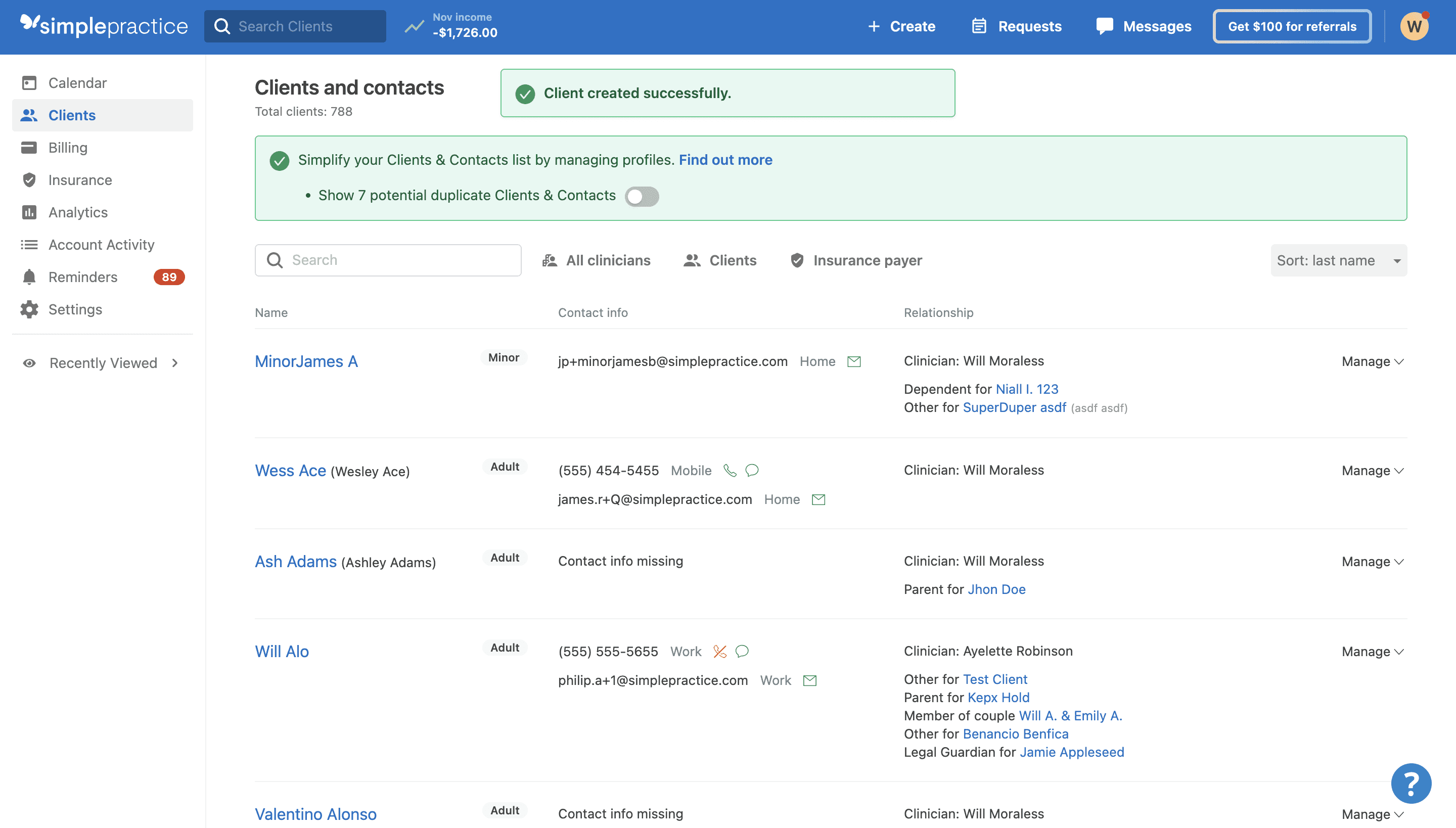
At present, our informational banners and success banners have identical appearances, even though they are distinct components. On the average screen size for our user (1440 px), our current success messages cover up links on standard pages, such as the client page, when they appear.
Success messages should be non-intrusive and discrete while still drawing attention to communicate to the users that their action succeeded or failed.
Research and Documentation
Introducing a More Efficient Method of Auditing Components for the Design Systems Team
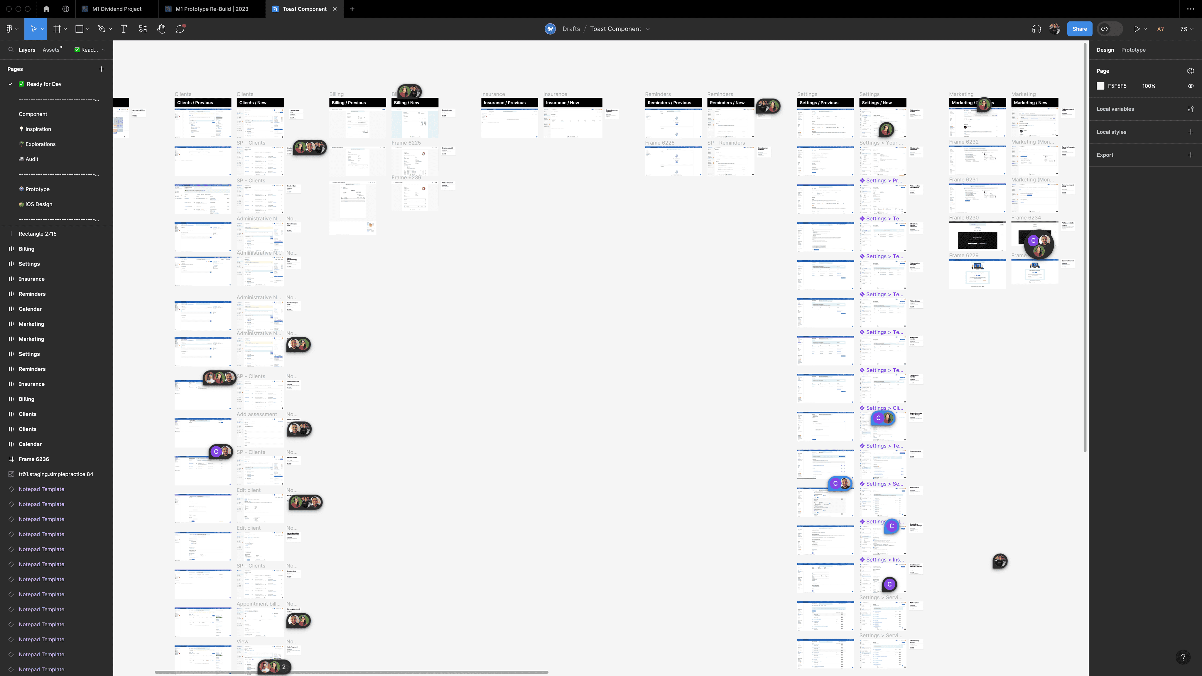
Given the widespread use of toasts and banners throughout the web app—potentially numbering in the hundreds—my initial approach involved mapping the app’s information architecture and generating as many banners as possible through typical user actions. While this method provided helpful insights, it risked overlooking instances that might not appear under ordinary usage. To address this gap, I leveraged my engineering background and requested access to the codebase. By searching for relevant components in GitHub, I efficiently located every instance of toasts and banners, ensuring a more comprehensive and accurate audit.


Ideation and Feedback
Getting Visual Design Feedback from the Design Team
I leveraged Slack to efficiently collect asynchronous feedback on a series of 12 toast notification prototypes.


Design Decision
Top-Center, Bottom-Center, or Bottom-Left? 🤔
Towards the end of this project, the top-center, bottom-center, and bottom-left were the top three candidates for placement. Top-center was eliminated because the SimplePractice community would experience the same problems as before.
Placing toasts at the top-center of the screen would also block and compete with future banners.


That left the bottom-left and bottom-center as the final two candidates. I was really torn between the two, but I decided that the bottom center would be best considering that the new navigation was left aligned and certain interactions would result in fly-outs from the left.
Usability Testing
Validating the Design and Placement Through Usability Testing
To prevent repeating past errors, we conducted user testing with a small group of six individuals. Our goal was to assess the effectiveness of the newly developed toast component in terms of its visibility and impact on user workflow. The toast was designed to be informative without disrupting the user's activities.
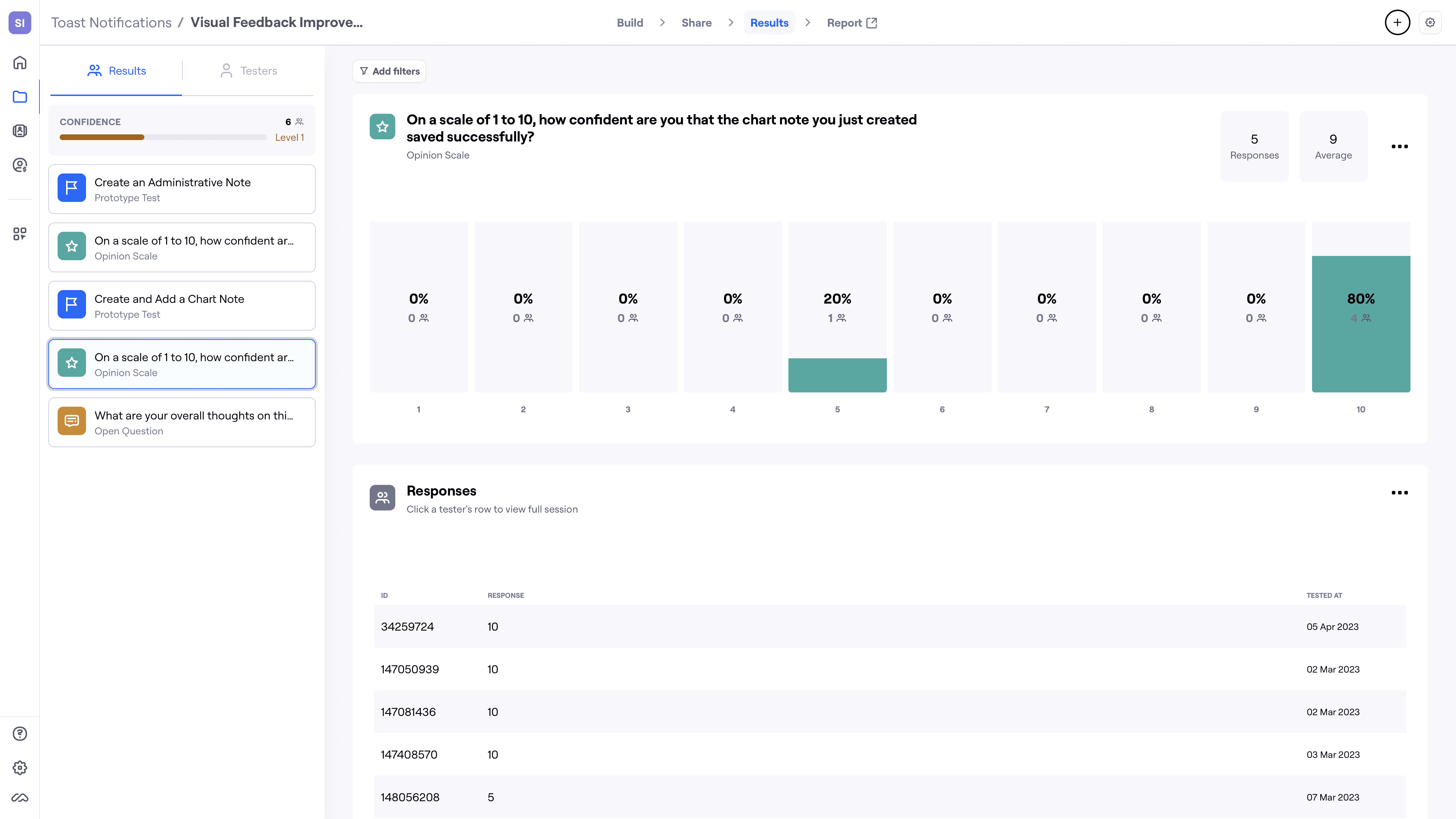
Our primary measure of success was whether users noticed the toast. Although the toast is meant to convey important notifications, it should not interfere with the user's workflow.
Design Decision
Burning the Error Toasts 🔥
We made the deliberate choice not to proceed with the transformation of error banners into toasts. This decision aimed to maintain the effectiveness of error messaging and uphold the principle of user-centric design, where clarity and assistance in error scenarios take precedence.
By retaining error banners, we ensured that users would receive comprehensive error feedback, including a clear explanation of the problem and specific calls to action (CTAs) to guide them in addressing the issue. This approach prioritized user experience and problem resolution, aligning with our commitment to providing users with the support they need when encountering errors.
Collaboration
Working with Content Design to Write Toasts Documentation
I worked with the content design team to create guidelines for toasts. In terms of Zeroheight documentation, most of the visuals were my responsibilities, as well as timing and placement since I focused on these subjects during various design critiques.

Learnings & Reflections
Asynchronous Feedback and Content Collaboration as a Force Multipliers
This project became one of my favorites because it demanded a higher level of collaboration than my usual design system work, ultimately making me a better designer. Collecting diverse input asynchronously on Slack highlighted how varied opinions can expose pitfalls I might have missed on my own—such as color choices or toast placement—and contributed to a more polished, user-centric final product.
Working closely with content designers further underscored how concise, descriptive messaging and clear next steps help maintain the utility of notifications without overwhelming users. Overall, this experience reinforced the importance of aligning design elements, technical feasibility, and content strategy to create solutions that truly prioritize user experience.

