
SimplePractice Design System
I worked on SimplePractice's design system, contributing to foundational components like toast notifications, dark mode color palettes, and standardized iconography. Through extensive research and systematic implementation, I helped create scalable patterns for product design.
Iconography
Creating a Unified Icon System
The existing suite of icons lacked standardization and consistency with the design system. Recognizing the need for a refresh, I embarked on a journey to update the iconography, thereby creating a unified reference point for both designers and engineers. My role encompassed a comprehensive audit of the current platform's iconography, facilitating their replacement, and documenting the usage guidelines.
Color
Crafting an Accessible Dark Mode Color System
Mobile design and engineering needed a better documented and accessible color palette for dark mode. Our initial color documentation was inefficient and not user-friendly. I was responsible for creating a robust and thoughtfully planned color palette to streamline the development process for the engineering team, the design team, and to enhance the experience of our dark mode mobile users.
With the utilization of Adobe's Leonardo tool, I was able to generate an adaptive color palette based on perceptual color models.
This new color palette meets specific contrast ratios and accessibility guidelines, ensuring visually appealing and legible designs under various light conditions.

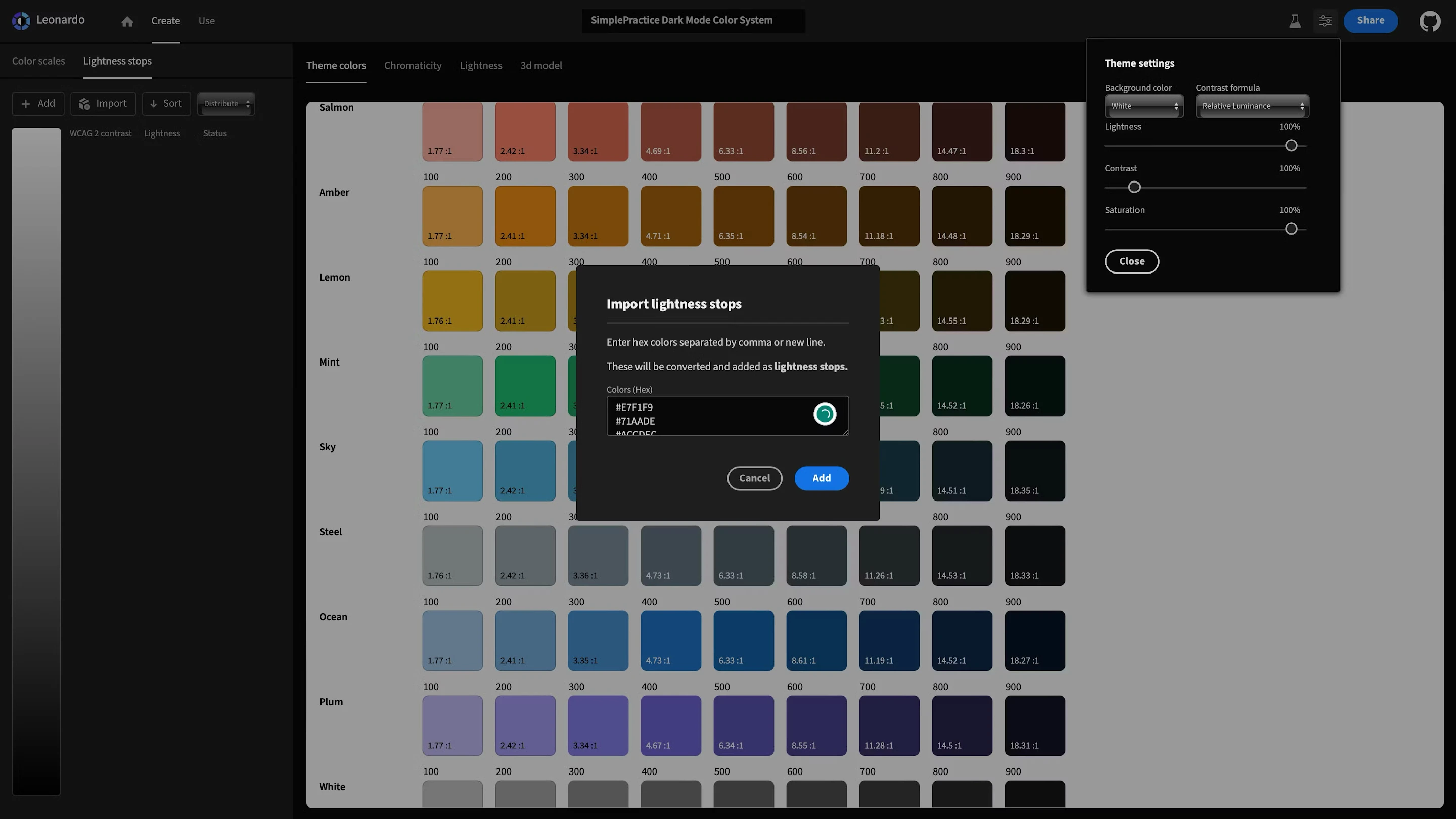
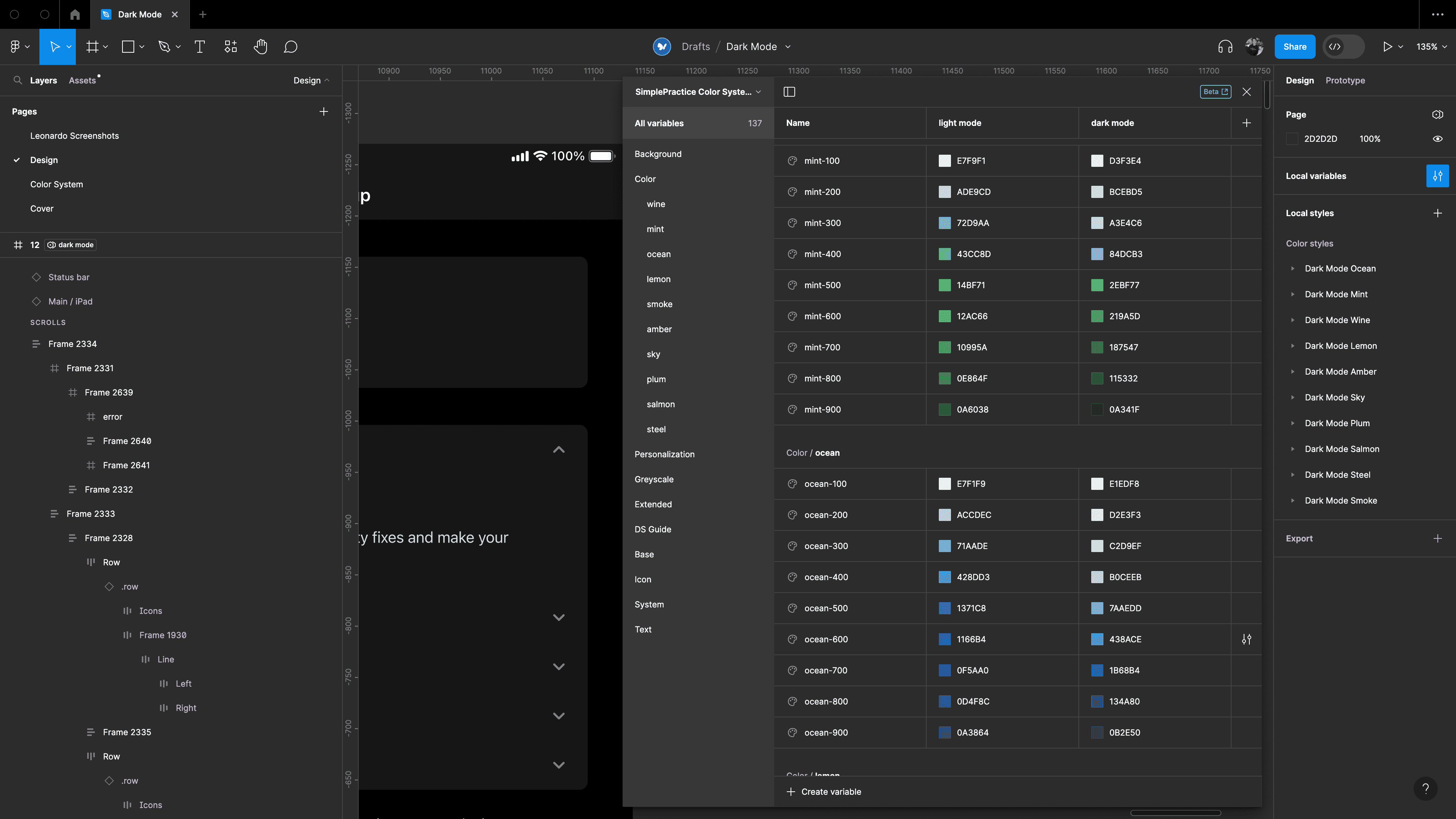

I collaborated with the Design System Lead to develop the Figma variables for our new dark mode color system, allowing designers to successfully switch between light and dark mode with ease.

Component Building
Redesigning The Toast Component
Toast notifications were temporarily released in early 2022 but rolled back due to complaints that they were annoying and appeared in cumbersome areas of the product (top right). There were also some instances of complaints about them being too visually dominant.


I worked with content design to redesign success messages as toast notifications positioned in the bottom-center of the screen, featuring a more subtle design. Through extensive team feedback via Slack and usability testing, I validated this new placement and design.
To make the audit process more efficient, I leveraged my engineering background to search the codebase directly through Github, creating comprehensive Notion databases to track all banner instances and their updates.
Documentation
Building Bridges Through Documentation
Documentation became a cornerstone of my design system work at SimplePractice, evolving into much more than just guidelines and specifications. For each major project, I developed multiple layers of documentation that served different purposes and audiences.


Little Big Component Update #1
Mapping the Dropzone Component to Color Variables
In our current dropzone component, the icons used are outdated and mapped to our archived icon library instead of the updated iconography that I updated for my first project.
Little Big Component Update #2
Adding a Text Property to the Modal Component for a Better Prototyping Experience
The designer workflow has been complicated because they have to manually add a text slot when using the modal component. Adding a text slot to this component would be a big improvement, and that was my task.
This component is slot-based, and I added a text property to the empty slot to solve the problem that designers were experiencing. Before updating this component, I was unaware of the "slot" method of creating components, but soon learned that it is a common practice. This component update helped me discover a new method of crafting components.
Little Big Component Update #3
Simplifying the Toggle Component by Reducing the Amount of Variants
The toggle component needed to be updated because there was no 1:1 between our switches and the toggle button, so interacting with the variants can give wonky results. I received suggestions that these should be separate components. For example, selecting the "Button" style and "Micro" size will revert the component to a toggle because it is missing properties at the button level. The button style of the toggle lacks two size variants that the toggle variant has. Another problem was that the toggle component had far too many variants, which made using it complex and difficult. To make the component easier to use and reduce the number of variants, I used variants, properties, and variables.
Little Big Component Update #4
Mapping the Tab Component to Our Type Scale and Adding a New State
Our current tab component is missing the disabled and focus states, and the counter element was not mapped to our type scale. I added the disabled state for the tab component and mapped the counter element to our type scale. The tab component was using an SF PRO font, which is not a font that we usually use.
Conclusion
New Skills Acquired: Technical Depth and Data-Driven Decision Making
Working on SimplePractice's design system transformed my understanding of systematic design. Through projects ranging from toast notifications to dark mode color systems, I discovered that what appeared as straightforward tasks often revealed layers of hidden complexity. Creating a dark mode palette or standardizing icons demanded deep technical understanding and collaboration with industry experts, teaching me that even simple updates cascade into systematic changes that affect the entire platform.
From my experience, success in design systems hinges on seamless collaboration between designers, engineers, and stakeholders. Through projects like the toast redesign and icon refactoring, I bridged the gap between design intent and technical implementation, ensuring solutions that worked for everyone involved. Perhaps most profoundly, I discovered the importance of grounding design decisions in real data rather than assumptions. From analyzing Figma analytics to tracking component usage through Slack, I learned that effective design systems must be built on concrete user insights rather than intuition alone.

